Sunday, January 21, 2007
ArtPact #9
Started an advanced workshop in watercolor portraits on Saturday.
Same incredible and fun teacher, WackieM (check out her work), with whom I took the beginning portrait workshop in the fall.
Same one-hour trip each direction to where the workshop is.
Same annoyance of getting up before 7am (on a Saturday!!!) and frantically packing tons of supplies into the car, in order to be there on time.
But - as opposed to the weekly workshop in the fall, this one is only once a month.
And, besides, it is sooooooooooooooooo worth it, big time!
Yesterday's lesson was about painting people of colored skin.
Political correctness aside for a second, it was about black people, or very dark skinned.
(Sorry, but African-Americans sounds stupid, as what about those who were born here and never ever set foot in Africa? It would be like calling Jews who forever lived in the US "Israeli-Americans". Eh?)
A-n-y-w-a-y, back to art:
Dark skin obviously means darker values, but it's much more than that. It allows you to use more rich colors, and there are somewhat different "rules" when it comes to which colors work better. Like, the color reflected off of dark skin has a lot of green, whereas with white skin, it's mostly blue.
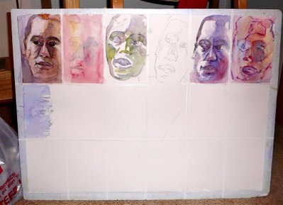
As a pre-workshop homework, WackieM had us divide a full-sheet of watercolor paper (namely, 22"x30") to 18 rectangles of 5"x7" (to the metric-speakers amongst my readers: I truly apologize. I fully understand your resentment, but - when it comes to art, I speak in the weird incomprehensible language of inches, feet and yards. A matter of survival, y'see).
As the workshop began, she explained that she wants us to work small, very small.
"Take your reference photos", she gracefully ordered us, "and start creating small paintings. Make a drawing on each rectangle, and then start painting. And work on several paintings at the same time".
Why??
Several reasons, all making great sense.
Now, great sense and art do not quite go hand in hand, but here we're talking the ultimate self-deception.
For one, working small takes away the fear of facing a big sheet of virginal empty paper, having it gaze back at you, and being terrified to put down the first brush stroke (which is always the hardest one).
Another big plus is that when working small, the drawing is more intuitive and loose and free and flowing and careless, as it feels more like a sketch than the obliging "preparation for a painting".
You find yourself caring less and less about what happens, as any potential mistake or failure will be done on a small scale, and you get into the blessed mindset of "Ah well, the hell with it, if it doesn't work out, then Pfffffffffffrrrrrrrrrrrrrrrr - I have so many more rectangles to try something else".
And, since you get to do several paintings of the same portrait, you are bound to try a lot of things: come up with a different composition, change the emphasis, use another style, try bolder color schemes, explore different techniques, try a new approaches, basically, you work in the "what if" mode - and as you get more and more into it, you get more creative.
After all, these are just little pieces of paper, and it's so fun to go wild and see what happens.
 So, it was a great day, time flew like the Concord, leaving us extremely adrenalized, and totally exhausted.
And we only did one row, mind you...
(like, about 6 rectangles, in varying stages of completion).
Having said all that, I feel obliged to announce that I really, REALLY hate painting in a class or a workshop.
When I paint, the world needs to come to a halt, or at least stay away.
I hardly ever paint when The JohnnyB is at home, but when I do, he knows it means a lot of quality and quiet time for him, and he becomes a very happy man.
And what other desire does a woman have more than making her husband happy?...
Painting in class means not having enough space, not having the materials you are used to, the easel you like, the solitude you need in order to create, the time to step back and examine your work, and add to it the irritating fact that it's basically a paint-on-demand situation, as you have to paint now - whether you feel like it or not.
But, as WackieM herself says, "The idea in a workshop is not to paint as you would at home, but to learn and try new things. You never get good results in a workshop. ".
As always, she is right.
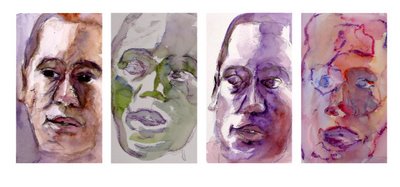
This is a close-up of the four of the portraits I did. I only chose the ones that got beyond the drawing or the very first wash. I kinda like the one on the left and the second from the right.
The JohnnyB is very afraid of the alien (not me, the legal alien, but the green dude below), and he really hates the one on the right.
 WackieM brought her own 2 sheets with several small portraits at different stages.
Just like ours, allegedly.
Yeah, right...
Needless to say, most of hers look like incredible works of art. Some of them are truly breathtaking, and it's a shame I cannot show them here. Y'know, rights and all.
So, we all sighed in envy, as you always do in workshops given by someone whose work you truly admire (did I mention you should check out her art? like this one, and this one, and many more on her website).
Then we continued to labor on our own little disasters...
And yet, this lesson opens such a huge field for exploration!!!
We actually have homework for next month's class: try and complete all 18 rectangles, using one or more reference photos, and then choose our favorite and create one (or more) "real" painting, based on what we have learned from all these little ones.
Should be interesting...
previous ArtPact... ...next ArtPact
Looking at them "closer" together like this, I think the alien (#2) has been attacking #4, and that's why his face is bleeding / injured.
BTW - when are you going to get with the times and move to "Beta", which mainline now, and us other "modern" bloggers won't have to go through extra hoops to leave comments.
The one on the left is quite good. Very realistic-portrait looking, which I imagine is some kind of great insult to an arteest.
Second from the right I like for the color, which looks almost moonlit, though the facial structure is a little more whacked-upside-the-head than the left on.
The one on the right is kinda horror-movie freaky, which is strangely alluring.
I don't like the green one, though.
W.r.t. JohnnyB, I converted to "new" blogger, and I don't have to go through any additional hoops to leave comments. The "new" blogger is definitely improved from the original in terms of ease of posting. I'm going to need to update my template to a "new" template pretty soon in order to get the new archived format that allows keywords and hierarchical dates.
The JohnnyB, well, at least this little assortment of attempted paintings makes you feel enough to actually bother and come up with a story.
In some crooked way, I guess I can look upon it as success.
CherkyB, Hey, you actually left arteestic-relevant critique! you feeling OK?
Thanks!
The moonlit guy probably got his head whacked while trying to defend the alien's victim from its ruthless attacker.
You almost managed to hit an exposed nerve with the "realistic" insult... as much as I try to go towards abstract, I keep sticking to realistic, at least in the beginning. That shall be fixed in the coming versions, so I hope.
Oh, and just for the record: I am not crazy about the green one, myself.
But - since it's just a start, would be fun to see if I can convert him to something better (couldn't get much worse, I presume).
As for tradition vs. progress when it comes to Blogger versions, well, my heart is bleeding for you, modern bloggers, for what you need to go through in order to leave comments.
So harsh is life.
But, let me ask you this, The JohnnyB:
When did I ever do the "mainline" thing?
After 5 years, you should know better.
Like, if I would have followed the mainline mindset, I would have never come here, and you wouldn't have to go through extra hoops to leave comments about green portraits.
Eh?
You're right, 'African-American' is stupid. I never thought about that. We all could have a prefix, and that would just slow things down.
Post a Comment
<< Home
BTW - when are you going to get with the times and move to "Beta", which mainline now, and us other "modern" bloggers won't have to go through extra hoops to leave comments.
Second from the right I like for the color, which looks almost moonlit, though the facial structure is a little more whacked-upside-the-head than the left on.
The one on the right is kinda horror-movie freaky, which is strangely alluring.
I don't like the green one, though.
In some crooked way, I guess I can look upon it as success.
CherkyB, Hey, you actually left arteestic-relevant critique! you feeling OK?
Thanks!
The moonlit guy probably got his head whacked while trying to defend the alien's victim from its ruthless attacker.
You almost managed to hit an exposed nerve with the "realistic" insult... as much as I try to go towards abstract, I keep sticking to realistic, at least in the beginning. That shall be fixed in the coming versions, so I hope.
Oh, and just for the record: I am not crazy about the green one, myself.
But - since it's just a start, would be fun to see if I can convert him to something better (couldn't get much worse, I presume).
So harsh is life.
But, let me ask you this, The JohnnyB:
When did I ever do the "mainline" thing?
After 5 years, you should know better.
Like, if I would have followed the mainline mindset, I would have never come here, and you wouldn't have to go through extra hoops to leave comments about green portraits.
Eh?

